Graphic

Graphic Design

Graphic design is art with a purpose. It involves a creative and systematic plan to solve a problem or achieve certain objectives, with the use of images, symbols or even words. It is visual communication and the aesthetic expression of concepts and ideas using various graphic elements and tools.

The Importance of Graphic Design for Business

The Importance of Graphic design for Business. “A picture speaks a thousand words”. And rightfully so; communication is a vital part of any business. ... The process of graphic designing involves combining technological, aesthetics and creative thinking to generate graphically communicative ideas.

We cite top five reasons of having a graphic designer for your business:

Helps create a strong impression

An impressive graphic design must leave an impact on the audience in the first instance. The challenge is to grab attention and keep them hooked on. And the only way to do this is creating a powerful graphic design.

Building a brand identity
It helps to convey your information
A good graphic design can narrate a story
5. Strong graphic design= Strong consumer trust

Elements of Graphic Design

Graphic design can use image-based designs involving photos, illustrations, logos and symbols, type-based designs, or a combination of both techniques. These designs can include various combinations of the following elements.

LINE:
Lines, in graphic design, can be used for a wide range of purposes: stressing a word or phrase, connecting content, creating patterns and more.

COLOUR:
Colour is used to generate emotions, define importance, create visual interest and unify branding. See our post on Colour Psychology for more detail.

TEXTURE:
Texture relates to the surface of an object. Using texture in graphic design adds depth and visual interest. This can be applied graphically in the form of pattern or through the choice of printable surface.

SIZE:
In graphic design, size is used to convey importance, attract attention and create contrast.

SHAPE:
The three basic shape types are Geometric (Circles, Squares, Triangles etc.), Natural (leaves, trees, people etc.) and abstract (icons, stylisations and graphic representations). Use carefully to create a visually pleasing design and eye-catching design.

SPACE:
A vital part of any good graphic design, Space is the area around the elements in a design. It can be used to separate or group information. Use it effectively to give the eye a rest, define importance and lead the eye to where you want it to travel.

VALUE:
Value is how light or dark an area looks in a design. It is everything from the darkest of blacks through to the brightest of whites. Used correctly it will create depth, contrast and emphasis.
Image
Image credit: ZevenDesign

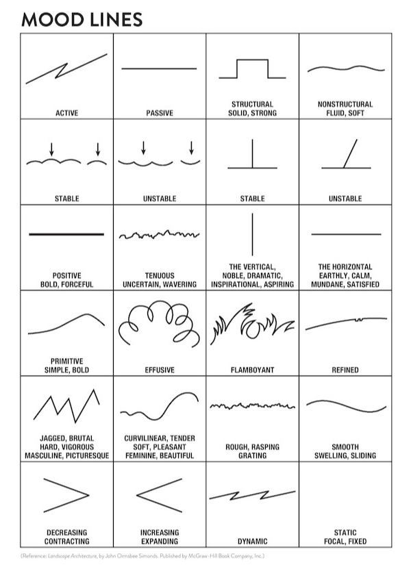
LINE

A designer might use a line to divide or unite elements on a page. Instead of elements being spread all about the document, lines are used to show strict boundaries between separate kinds of content.


Lines also denote direction of movement, like when a diagonal line or arrow is used. They also provide an anchor to hold elements together so that the lines at the top, bottom, or sides of a page can denote the limits for where the elements should exist.

Lines are also used to make patterns, and can be long or short, straight or curved, horizontal, vertical, or diagonal. There are also different kinds of lines, such as solid, dashed, thick, thin, or of variable width
Source

Color

Newton's visual categorization system for color was adopted and expanded upon by scientists, artists, and philosophers over the years, eventually resulting in the modern color wheel we all know today. 
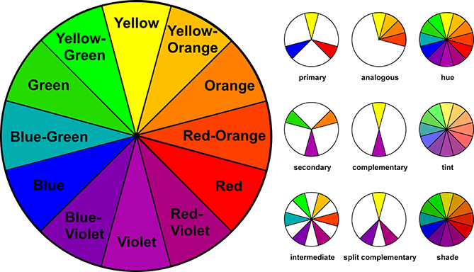
When selecting hues for a project, consider colors that appear directly opposite or beside each other on the color wheel -- these tend to produce the most consistently pleasing combinations. You could also consider using a free online color scheming tool, like ColorSchemer, to do the work for you.
Source
Image
Image

TEXTURE

Texture refers to the surface quality in a work of art. We associate textures with the way that things look or feel. Everything has some type of texture. We describe things as being rough, smooth, silky, shiny, fuzzy and so on. Some things feel just as they appear; this is called real or actual texture. Some things look like they are rough but are actually smooth. Texture that is created to look like something it is not, is called visual or implied texture.

Texture may be used in a work of art to:

  • create visual interest or a focal point in a compostion
  • to create contrast within a design compostion
  • to help visually balance a design compostion 
Source

Scale

The scale of different elements in a design will have a big impact on how your audience views and makes sense of your composition. Playing with the relative size of different components in your design allows you to set a focal point, highlight areas of importance, and ultimately guide viewers' eyes through the piece.

Scale isn't quite the same thing as size (though many people tend to incorrectly use them interchangeably when discussing design, i.e., "Make the logo bigger!"). Size refers to an absolute measurement (e.g., the sheet of paper 8'' by 11'') while scale refers to the direct relationship between elements in a design (e.g., the circle is twice as big as the square).

You can use scale to create a visual hierarchy for your design. When an element is displayed at a relatively larger scale than the other elements in a composition, our eyes are naturally drawn to it.

Source
Image

The Importance Of Graphic Design In Social Media

Any and everything you use in your daily life has been designed to suit your convenience and aesthetic sensibilities. And the only reason you use those things is that you like them. Now think about the-plethora of content you see daily on social media platforms. Social media feeds are flooded with so much new information for you to consume. I bet you don’t really remember 90% of them, do you? This is where graphic design comes into the picture. The 10% content from social media, which you remember has a catchy image or a design so intriguing that you absolutely tempted to share it, without giving it a second thought.An astounding 93% of brands use social media for marketing. Thus, it has almost become mandatory from brands to have an excellent graphics design team for their social media pages.

Let’s list down reasons why brands, marketing on social media need a good graphic design for their content.

  1. Due to decreasing attention spans, social media content should be so engrossing that it captivates user’s attention at the very first look.
  2. A good design has a better chance of being remembered and also if users relate to the image they may end up sharing it. So good designs equal more engagement!
  3. An attractive graphic design of social media posts creates a very positive image and builds brand recognition.
  4. A good graphic designer understands the requirements of the client company and their consumers’ way better.
  5. People don’t like reading the text and tend to acquire new knowledge by visual contact and react on the basis what they see.
  6. Social media images are not only used to advertise the company’s products but also can be used to convey a company’s culture, values and vision. A good design can express what your brand stands for.
  7. A very well designed logo is the “face” of a brand and gives it a unique identity.
Source

Purpose of graphics in web design

  1. Graphics add visual/aesthetic appeal to the information on the web page, helping to maintain viewer interest and attention
  2. Help to create visual structure for information and links on the page
  3. Communicate or explain ideas visually

Guidelines for effective use of web graphics

  1. Graphics should fit in with the purpose, organization, and style of the page. They should enhance the design, structure, or informative content of the web page without distracting attention. As much as you may want to add an image to a page because it shows off some fancy new effect you learned in the graphics program, think first about whether it fits in or not. You may want to keep these types of graphics in your personal portfolio under the heading, “Cool Effects I Know in My Graphics Program.”
  2. Avoid using graphics with large file sizes that add to the load time of the page. Also, consider the cumulative file size of all images on the page. Excessive “page weight” caused by poor image use can result in slow load times for pages. According to the Yale University Web Style Guide, 2nd Edition, "At today's average modem speeds most pages designed for users dialing in from home should contain no more than 50 to 75 kilobytes of graphics."
  3. Graphics should help to guide the viewers’ focus to the important content on the page. Using visually strong graphic elements on a page can be useful in directing viewers' attention and providing structure for the page. Be careful, though. Strong graphic elements can also pull attention away from central content or compete with one another on the page. This results in the page appearing overly busy or cluttered and makes it difficult to read. Remember, if you attempt to emphasize everything then nothing ends up standing out.
  4. Avoid repetitive use of overly bright or potentially “obnoxious” images. These types of "eye catching" images may be attractive at first, but after the novelty wears off, they may cause viewers to lose patience with the site. While an animation of a dancing monkey may seem interesting and funny at first, over time it may become annoying and drive viewers away.
  5. Avoid the use of graphics to convey textual content information. While it may be tempting from a design standpoint to use images for textual information because of the greater number of design options such as font choices and text effects, graphic based text presents a variety of problems: Images of text can't be resized like true text, so users with poor vision are unable to resize it to meet their visual needs; images require much longer to download than text; users can't search for images of text using their browser's find feature; and search engines are better able to index websites that contain actual text, well-structured with HTML.
  6. Provide textual equivalent alternatives for graphic content. Remember that not all users are able to see the images on your web page. Whenever images are used, it is important to provide equivalent content or descriptions of the image in a textual format. The most common way this is done is to provide descriptive text using the ALT attribute. This is especially important where images are used as navigation buttons or links. For a more in depth look at using alternate text with graphics to improve accessibility, read the section on Graphics Markup within the Web Style Guide.
  7. When using text in graphics, make sure there is sufficient contrast between the text and the background color. Design graphic elements so that users can easily distinguish the text from its background. Also, be sure to avoid color combinations (reds and greens for example) that color blind users will not be able to distinguish apart from one another.

online platforms for edit and design

DesignBold

DesignBold is a tool that’s quite similar to Canva. While you’ll feel right at home in DesignBold’s interface if you’re already familiar with Canva, DesignBold does do a couple things well to differentiate itself.

First off, it has a much larger selection of stock photos. SO if you were always disappointed by the stock photos available in Canva, you’ll be happy to know that DesignBold struck a deal with the popular stock photo site DepositPhotos to make all of DepositPhotos’ stock images available inside DesignBold (for a fee of course).

Additionally, DesignBold has a whole new set of templates that you can choose from when you’re creating your designs.

Like Canva, DesignBold has a stellar free plan. Then, if you want more features, you can upgrade to a paid plan to get access to tools like:

  • 20MB upload limit (free plan is 5MB)
  • Download transparent PNG
  • Download PDF for Print (in beta)
  • Custom color palettes for your own design info
  • Ability to upload custom fonts
  • Magic resize tool to reuse the same design across different dimensions

The pro plan starts at $19 per month.

Snappa
fotor
Desygner
Piktochart
Announcements
Book Covers
Bookmarks
Brochures
Business Cards
Calendar
Cards
CD Covers
Certificates
Class Schedules
Coupons
Desktop Wallpapers
Flyers
Gift Certificates
ID Cards
Infographics
Invitations
Invoices
Labels
Lesson Plans
Letters
Letterheads
Logos
Magazine Covers
Media Kits
Menus
Newsletters
Photo Collages
Planners
Postcards
Posters
Presentations
Programs
Proposals
Rack Cards
Recipe Cards
Reports
Report Cards
Resumes
Social Graphics
Tags
Tickets
Web Ads
Web Banners
Worksheets

Pricing your project

Rates charged by graphic designers on Upwork vary from $20 to $150 an hour, with an average rate around $45 per hour. However, designers don’t always bill hourly; it’s also common for a designer to set a fixed price for the work, based on their understanding of your project requirements. Here’s a look at some of the more significant considerations.

Expertise and experience

When it comes to setting individual rates, a seasoned designer can typically work faster while delivering more value to their clients with deeper insights into their work; their pricing often scales up to match. Location and local market conditions can also influence a graphic designer’s rates. Another factor is a designer’s reputation. Someone who’s still building their portfolio may price more competitively than a professional booking one or two months out. Finding the right freelancer means matching your goal with the type of designer and industry experience needed to get the results you want.

Scope of work

Quotes for your project will all reflect one critical point: The scope of work, or how much you actually need a designer to do. Whether you want an illustration to go with your next blog post or packaging for your newest product, the production process may include:

  • Consultation
  • Research into your industry, marketplace, and audience
  • Brainstorming ideas
  • Creating concepts
  • Identifying the right typeface, color palette, and other materials
  • Generating various concepts
  • Review and approval process
  • Producing the final deliverable

A fixed-price project will also typically specify the number of iterations (i.e. rounds of revisions) included in the price.

where to find freelance graphic designers

Find and work with talented freelance designers online.

Dribbble

Dribbble is a community of web designers, graphic designers, illustrators, icon artists, typographers, logo designers, and other creative types share small screenshots (shots) that show their work, process, and current projects. It’s a place to show and tell, promote, discover, and explore design. Headquartered in Salem, Massachusetts, Dribbble began as a side project and is now a tiny, bootstrapped and profitable company helping the world’s design talent share their creations and get hired. Dribbble has become a go-to resource for discovering and connecting with designers around the globe.

Behance
Zerply
deviantART
Forrst

6 Tips To Find Graphic Designers For Your Small Businesses

Check Out Your Competitors First
Before you get any graphic designers to create your logo design etc, you should always see what your competition is doing. This isn’t about copying their work. You should find out what style of graphic designs your competitors are following. Then, come out with something unique. Hire a graphic designer whose design style will give you the desired results.

If you’re new to the industry, make sure that you check out your competitors’ work in detail before you go to a designer. This will help you establish your needs more clearly. You can then choose the right designer with this knowledge.

Start With A Clear Idea
Do Some Research
Watch For Flexible Designers
Insist On Multiple Concepts
Crowdsource It
Advering Digital Marketing